Advokait Doula Services needed an identity that felt like its founder: a fiercely protective dog-mom with big-sister, slightly irreverent energy. In a sea of incense-hazed doula brands, we built something wilder — and more real.
I designed the logo and visual identity to let Kaitlyn’s personality shine through — playful but purposeful, serious about birth justice without taking itself too seriously. I pitched the wolf as the central symbol — the ancestor of the dog: loyal, watchful, and just outside the system.
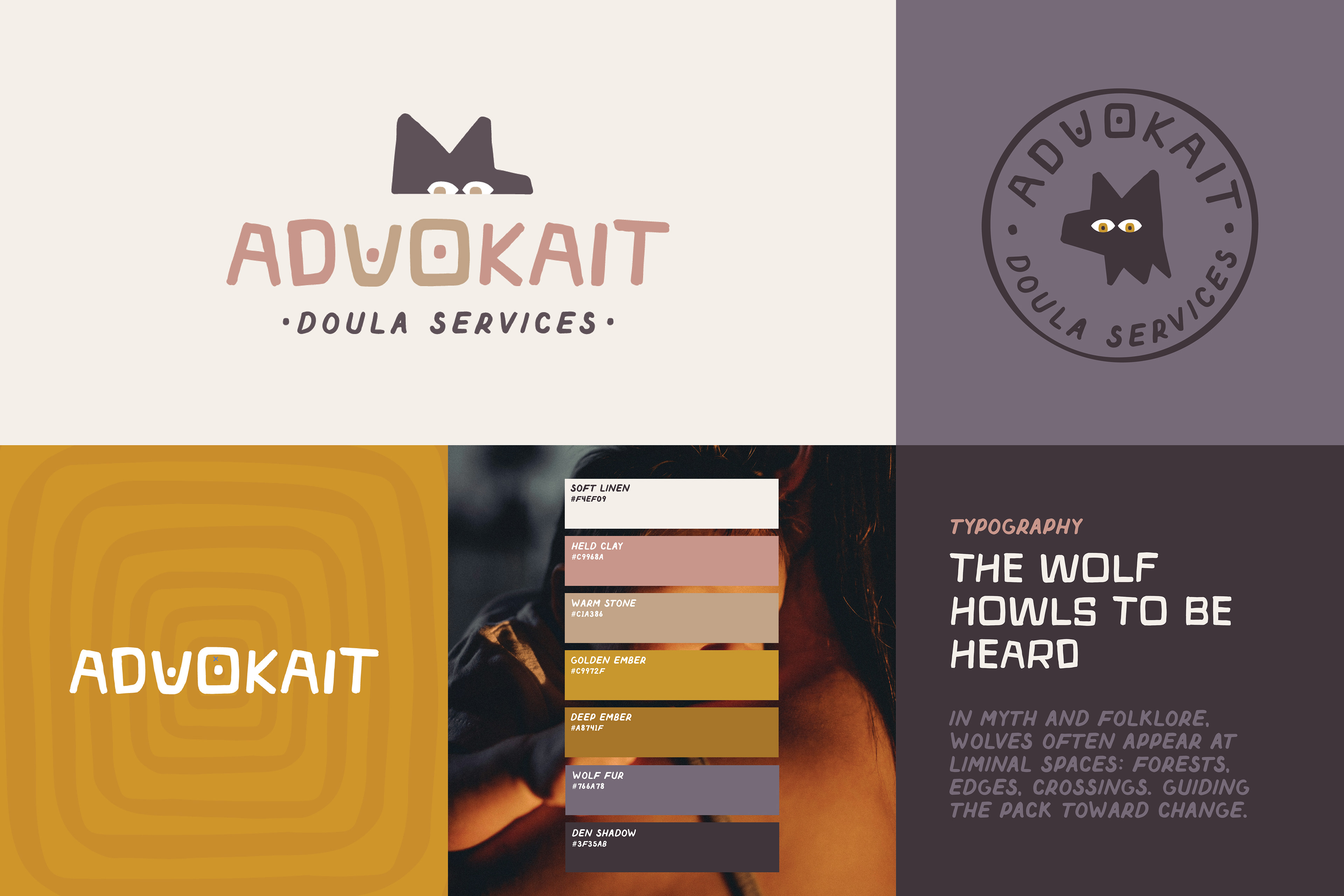
Wolves howl to be heard. A doula does too, sometimes within systems and institutions that don’t always listen. And just as wolves protect their packs, doulas protect their clients — fiercely, instinctively, and without apology.
In myth and folklore, wolves appear at thresholds and crossings, carrying ancestral knowledge of the wild. Birth is itself a liminal experience — a crossing into something new — and the wolf became a way to represent both fierce protection and inherited wisdom.
The wordmark quietly honors the body. The “V” and “O” forms suggest breasts — a nod to nourishment, touch, and postpartum care. The rounded “O” is further abstracted into a portal shape within a repeatable brand pattern, reinforcing themes of transition and passage into new life.
The palette balances warmth and depth: soft linen and held clay meet embers and a deep neutral, den shadow. The result feels earthy and grounded rather than precious or overly mystical. Typography reinforces the tone: hand-drawn, approachable, and expressive.
The wolf howls to be heard — and so does the brand.